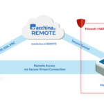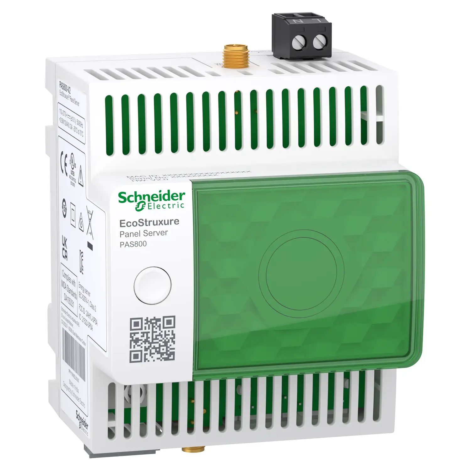
Getting value from energy data depends on one thing: visibility. EcoStruxure Panel Server PAS800 gives that visibility through a web interface that moves from a high-level dashboard to live device data, historical trends, CSV exports, and aggregated views by usage or zone.
This walkthrough covers the parts of the interface shown in Schneider Electric’s tutorial, from login to comparison plots. It also shows how the Home tab, Monitoring and Control section, and aggregated views fit together, so the data makes sense at both the panel level and the device level. For product context, Schneider’s Discover Panel Server page and this overview of the EcoStruxure Panel Server PAS800 for smart energy management help frame where PAS800 sits in an energy monitoring setup.
Access the Panel Server web interface
The process starts at the device’s web page. After opening the address in a browser, sign in with the credentials tied to that Panel Server. Once logged in, the interface exposes the main tabs used for visualization and monitoring.
A simple login flow looks like this:
- Open the Panel Server web page from the device’s network address.
- Enter the assigned credentials for that installation.
- Sign in and confirm the main tabs load, including Home and Monitoring and Control.
After login, the layout matters because each section serves a different job. The Home tab gives a broad view of energy use across all added devices. Monitoring and Control shifts to live values and trend plots. Aggregated views then roll data up by business-friendly labels such as usage and zone.
Schneider’s official Panel Server webpages overview shows how those pages are organized inside the platform.
The charts only tell a clear story when commissioning data is clean. Commodity type, usage type, and zone labels are all assigned earlier, so the visualization layer depends on that setup work.
That point explains why the same system can support both quick checks and deeper analysis. Once devices are added correctly, the web pages become a direct window into energy behavior instead of a raw list of measurements.
Use the Home tab to compare energy consumption at a glance
The Home tab acts like a control-room summary. It gathers the energy consumption of all devices that were added to the Panel Server and places that data into a few comparison views. That makes it the fastest place to spot patterns before moving into device-level detail.
Start with commodity and period selection
At the top level, the dashboard works with commodity types that were predefined and assigned during commissioning. In the example shown, the selected commodity is electricity and the period is set to 4 weeks. Both period 1 and period 2 stay at their default values.
That combination creates a period-to-period comparison without changing the baseline settings first. It’s a practical starting point because the chart immediately shows whether consumption shifted over the selected time span.
The core selections in this view are straightforward:
- Commodity: Electricity
- Time period: 4 weeks
- Comparison windows: Period 1 and Period 2, left at default
The other labels on the screen, usage type and zone, were also chosen earlier when the devices were added to the Panel Server. Because of that, the dashboard can sort the same energy data in ways that match how a site is organized, either by function or by location.
Compare consumption by usage first
Once the commodity and period are set, the Home tab shows an energy consumption comparison by usage across the two periods. This is often the clearest first pass because it groups devices by how they are used, not just where they sit physically.
For example, a building may have lighting, HVAC, and other categories mapped as usages. The chart then compares those usage groups between period 1 and period 2. Instead of sifting through each meter one by one, the viewer sees category-level movement right away.
The chart also supports a quick drill-down. Selecting one of the usage entries changes the graph, and the system then displays the zones that belong to that specific usage. In other words, the display moves from “Which function used more energy?” to “Which areas inside that function explain the change?”
That step is useful because it keeps the context. The viewer does not leave the dashboard or rebuild the chart. One click shifts the level of detail while staying inside the same usage category.
Scroll down to compare by zone
Further down, the Home tab provides a comparison graph by zone. This flips the first view around. Instead of organizing the data by usage, it organizes it by location or area.
That change matters because some problems show up more clearly on a floor, room, or zone basis than on a usage basis. A zone view can expose whether one part of a site is consistently heavier than another across the same time range.
The interaction is similar to the usage chart. When a zone is selected from the legend, the graph changes again and splits the data into the usages for that specific zone. So the dashboard supports two logical drill paths:
- From usage to the zones inside that usage
- From zone to the usages inside that zone
This two-way drill-down makes the Home tab more than a summary page. It becomes a fast comparison layer that helps narrow the search before moving into real-time or historical views.
Open Monitoring and Control for live and historical views
While the Home tab answers “where is consumption changing,” Monitoring and Control answers “what is happening right now” and “what happened over time.” This section is where the interface becomes more operational.
Group devices by usage or zone
Inside Monitoring and Control, the list of devices can be grouped by usage or by zone. That simple grouping option has a big effect on readability. When devices are arranged by the same labels used on the dashboard, the jump from site-level view to device-level view feels consistent.
Grouping by usage works well when the goal is to inspect a functional category, such as lighting or another load type. Grouping by zone works better when the goal is to inspect a physical area. Either way, the grouping reduces visual noise and makes the left-side device list easier to scan.
The broader behavior of these pages is covered in the official Panel Server user guide.
Use Device view for one device at a time
The Device view shows real-time data for the device selected in the left panel. This is the direct, focused view. It is meant for looking at one asset without distraction from the rest of the system.
Because it is tied to the selected item in the list, the context stays simple. Pick a device, then read its live measurements. That is useful for validation, checks after commissioning, or quick confirmation that a device is reporting as expected.
The transcript does not list every measurement type shown in this panel, so the safest reading is that Device view presents the real-time values available for the chosen device.
Use Multi-device view for side-by-side checks
The Multi-device view broadens the screen from one asset to several. It can display up to two types of data across up to five devices.
That layout supports side-by-side comparison without losing readability. Five devices is enough to compare feeders, subpanels, or selected loads from the same zone. Limiting the display to two measurement types also keeps the chart from becoming cluttered.
A multi-device screen is often where patterns start to stand out. A single device may look normal on its own, yet the comparison can show that one unit is trending above its peers or that one area reacts differently over the same time window.
Use Trending for historical plots and compare mode
The Trending view shifts from live values to history. It shows the historical plot of the selected devices and measurements, which makes it the right place for looking at behavior over time rather than at a single moment.
Schneider’s data trending guide gives more detail on how trend data is handled in Panel Server.
Trending also includes compare mode. In that mode, period 1 and period 2 can be selected to create a comparison plot. That feature mirrors the comparison logic seen on the Home tab, but now it applies inside the historical view. The result is a more focused time-based comparison at the selected device and measurement level.
So the Monitoring and Control section supports three layers of analysis in one area: real-time values for one device, live comparison across several devices, and historical plotting with period-to-period comparison.
Export trend data and use aggregated views for totals
Once the charts tell the story, the next step is often to move the data out of the interface or roll it up into totals. Panel Server covers both needs with CSV export and aggregated views.
Export CSV files from the Trending view
The plotted data can be exported to a CSV file by selecting Export. The example shown makes one thing clear: the downloaded file lines up with the time interval selected earlier in the trend view.
That matters because it keeps the export aligned with what the user just reviewed on screen. There is no mismatch between the chart window and the downloaded dataset. For reporting, troubleshooting, or outside analysis, that consistency saves time and cuts down on rework.
Schneider documents this process in its local CSV export guide.
Read aggregated totals by usage or by zone
Beyond device-level trends, Panel Server also provides aggregated views. These views summarize consumption rather than showing each device separately.
The aggregated view by usage displays the total consumption for a selected commodity and usage category. If the goal is to understand how much electricity a functional group consumed, this is the direct view for that task.
The aggregated view by zone organizes the same kind of consumption data by location. That is useful when reporting by area, floor, room group, or another site-based structure.
This quick table shows the difference:
| View Type | What It Shows | Compare Mode | | | | | | By Usage | Total consumption for a selected commodity and usage category | Yes | | By Zone | Consumption organized by zone | Yes |
Both sections also support compare modes, so totals are not limited to one period at a time. That makes aggregated views useful for benchmarking, internal reporting, and quick checks on where a change happened at the category or zone level.
Practical habits that make Panel Server charts easier to read
A good interface still depends on good reading habits. Panel Server gives several ways to view the same energy data, and the clearest results come from moving through those views in a logical order.
Start at the Home tab when the goal is broad comparison. That page gives the fastest read on whether a change sits in a usage category or in a zone. After that, move to Monitoring and Control to inspect the related devices in real time or in historical context. Finally, use the aggregated views when the job calls for totals rather than raw device plots.
A few habits improve clarity:
- Keep the time window consistent when comparing periods, so the charts reflect the same basis.
- Use usage and zone grouping on purpose, because each tells a different story.
- Export trend data when the screen view becomes a report, especially when others need the same interval offline.
The structure of the interface works a bit like a map. First, the Home tab shows the city. Then Monitoring and Control shows the street. After that, the aggregated views turn the trip into a summary table that is easy to share.
That layered approach is what makes the PAS800 interface practical. It does not force a choice between overview and detail. Instead, it lets both views support each other.
Conclusion
EcoStruxure Panel Server PAS800 turns energy data into something readable, from dashboard comparisons to live device values, trend plots, CSV exports, and totalized views by usage or zone. The Home tab is best for fast pattern checks, while Monitoring and Control brings the detail needed for deeper analysis. Aggregated views then close the loop by translating raw measurements into site-level totals. When the setup labels are correct at commissioning, the whole interface becomes a reliable picture of how energy is being used.