A data server is only useful if people can read the data quickly. In EcoStruxure Panel Server PAS800, the built-in web pages give operators a direct way to view energy use, compare time periods, and check live values without jumping between tools.
Once access is in place and devices have been added, the interface breaks the job into a few clear views. The Home tab gives a high-level energy picture. Monitoring and Control show live measurements. Trending handles historical plots and CSV export. Aggregated views roll consumption up by usage or zone, which makes it easier to spot where energy goes.
That structure matters because panel data can get noisy fast. A good visualization layer turns a long device list into something that feels more like a map than a spreadsheet.
What you need before data visualization starts to make sense
The data views in Panel Server depend on how devices were set up earlier. After signing in to the device web page with the right credentials, the first thing to remember is that the dashboard doesn’t invent categories on its own. Commodity type, usage type, and zone are assigned during commissioning and device onboarding.
That means the quality of the charts depends on the quality of the setup. If a meter was tagged as electricity, assigned to a usage category, and placed in the correct zone, the later views will group it correctly. If those tags were skipped or set poorly, the charts may still load, but the story they tell won’t be very useful.
Usage and zone charts only work well when those fields were assigned correctly during commissioning.
This is why Panel Server behaves more like an energy data organizer than a simple meter viewer. It doesn’t just show raw values. It also sorts those values by the structure defined during setup.
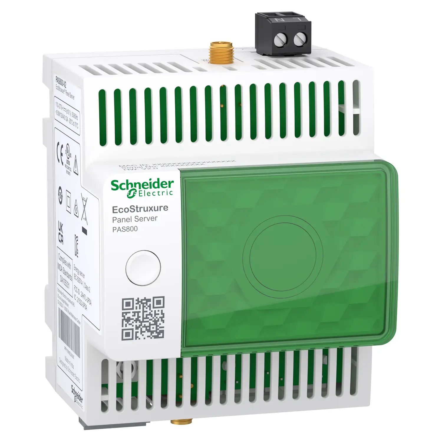
For readers who want product-level details, the PAS800 Panel Server datasheet gives a quick summary of the platform. Schneider Electric also describes the unit on its PAS800 product page, where it’s positioned as an advanced datalogger and energy server.
With that base in place, the main views become much easier to read. Each one answers a different operational question, from “where did the energy go?” to “what is happening right now?”
How the Home tab turns device data into an energy summary
The Home tab acts as the high-level dashboard for all added devices. It starts with total energy information grouped by commodity. In the example shown, the selected commodity is electricity, and the time range is set to 4 weeks. Period 1 and Period 2 stay at their default settings, which allows the system to compare two time windows side by side.
At this stage, the display compares energy consumption by usage. Because usage types were selected when devices were added to the Panel Server, the chart can split the total into logical categories. That makes it easier to tell whether energy is going into lighting, HVAC, monitoring, control, or another configured group.
The useful part is the drill-down behavior. When a user selects one usage from the chart legend, the view changes. Instead of staying at the usage level, the graph now breaks that specific usage into the zones that belong to it. In other words, the first chart answers, “Which usage consumes the most?” The second answers, “Where inside that usage is the energy going?”
After going back and scrolling down, the dashboard shows a comparison graph by zone. This works in the same way, only from the opposite direction. Select a zone in the legend, and the graph splits that zone by usage. That reversal is helpful because it lets users move from a building-area view to a functional-use view without changing sections.
The dashboard behavior is easier to see in a quick summary:
| View | Main grouping | What happens when you select a legend item |
|---|---|---|
| Home comparison by usage | Usage category | The chart breaks that usage into zones |
| Home comparison by zone | Zone | The chart breaks that zone into usages |
The main benefit is context. Instead of staring at one big energy number, operators can move between use-based and area-based views in a few clicks.
Monitoring and Control shows what’s happening right now
While the Home tab focuses on summarized consumption, the Monitoring and Control section focuses on real-time data. This is where the system shifts from trend reading to live observation.
The device list on the left can be grouped by usage or by zone. That sounds simple, but it changes how quickly a problem can be found. A maintenance team might prefer a zone-based view if they’re checking one floor or one panel area. An energy manager might prefer a usage-based view if they want to look across all cooling loads or all monitoring loads at once.
In Device view, the right side of the screen shows the real-time measurements for the device selected in the left panel. This is the one-to-one view. It’s best when a user wants to inspect a single meter or breaker-related measurement in detail.
The interface also includes a multi-device view. That mode allows the display of measurements from several devices at once, up to five devices, and up to two types of data at the same time. That limit matters because it keeps the view readable. Instead of trying to pack dozens of signals into one graph, the system keeps the comparison focused.
This is where live monitoring becomes practical. A user can compare similar values from multiple devices, such as a shared measurement class across several feeders, without opening each device one by one. That saves time during checks, especially when looking for outliers.
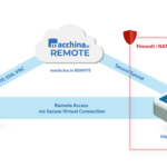
Schneider Electric users who want more context on local live data access may find the community discussion on getting live data without Schneider Cloud useful. It lines up well with the role of embedded web pages for direct monitoring.
Trending mode helps you read history, not just live values
Real-time numbers tell you what is happening now. Trending tells you whether today’s pattern is normal. In Panel Server, the Trending section shows a historical plot for the selected devices and measurements.
That historical view is important because energy issues often hide in patterns, not in one instant. A single live reading may look fine. A week of readings may show nightly waste, weekend drift, or a load that grows every Monday morning. Trend charts make those patterns visible.
The section also supports CSV export. When the export button is used, the downloaded file matches the time interval that was selected earlier. That detail is easy to miss, but it matters. If the wrong range is selected before export, the file will still download, just with the wrong data window.
Exported CSV data follows the selected time interval, so set the range first and export second.
That CSV output is useful for offline checks, reporting, or importing data into another analysis tool. It also gives users a way to validate what they saw on the graph with raw time-based values.
Panel Server also includes a Compare mode in Trending. In this mode, Period 1 and Period 2 can be selected to create a comparison plot. This makes historical review much more actionable. Instead of looking at one trace in isolation, users can compare two periods directly. For example, that could mean one month versus another, or a recent week versus a prior baseline.
If historical access is a key part of your workflow, the Schneider Electric community thread on PAS800 historical data access adds practical context around stored data and retrieval.
Aggregated views make it easier to compare consumption by usage or zone
Panel Server doesn’t stop at device-level charts. It also provides aggregated views, which roll data up into broader categories. These views are useful when the goal is not to inspect one device, but to understand total consumption for a part of the site.
Aggregated view by usage
The aggregated view by usage displays the total consumption for a selected commodity and usage category. If the selected commodity is electricity, for example, the chart shows how much total electrical consumption is tied to each usage grouping.
This is helpful when the question is operational rather than electrical. A site manager may not care which exact meter created the load spike at first. They may want to know whether the increase came from process load, auxiliary load, monitoring systems, or another usage bucket. The usage-based aggregate answers that quickly.
Because the categories come from commissioning, this view works best when the initial data model was planned well. A strong tagging structure gives clean rollups. A weak tagging structure creates mixed groups that are harder to trust.
Aggregated view by zone
The aggregated view by zone organizes the same consumption data by zone instead of function. That makes it better for physical area analysis. If one room, floor, tenant area, or panel section is responsible for unusual use, this view is where it will stand out first.
This can be especially helpful during site reviews. Zone-based aggregation lets teams compare spaces against each other without diving into each underlying device. It turns many device points into a short list of areas.
Both aggregated sections also include Compare modes. That means the same period-to-period logic used in Trending can also support broader consumption comparisons at the category level. In practice, that lets users compare changes by function or by location, not just by one measurement trace.
For readers who want more background material, the PAS800 Panel Server user guide can help fill in model-specific details around operation and setup.
Why this data layout works well for daily energy management
The strength of the Panel Server interface is not one single chart. It’s the way each section supports a different layer of analysis.
The Home tab gives the fast summary. Monitoring and Control gives live readings. Trending gives historical proof. Aggregated views give management-level rollups. Put together, those layers form a clean path from broad energy review down to specific device behavior.
That structure also reduces the common problem of jumping between raw device lists and outside spreadsheets too early. Users can start with a high-level comparison, narrow it by usage or zone, check live values, then export data only when deeper analysis is needed. In other words, the interface supports both quick checks and more serious investigation.
For technical teams, this is often the difference between data availability and data usefulness. A server may collect thousands of points, but if the view doesn’t help people sort them, the value stays trapped. Panel Server avoids that by keeping its main visualization paths tied to commissioning metadata, time windows, and focused comparison modes.
In short, visualization is what turns stored measurements into decisions. With the right setup, EcoStruxure Panel Server PAS800 makes that step much easier, whether the goal is to watch live performance, compare two periods, or find which zone or usage is driving consumption.